Takeaway
Sometimes it really is about usability: help your site visitors to compare your products.
Starting point
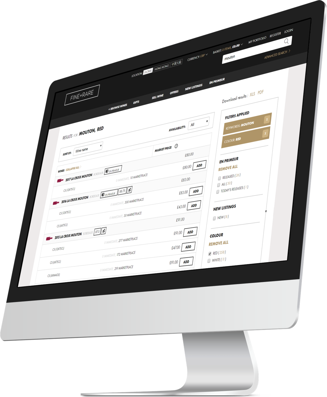
The control page used a product grid, so very few wines were visible in the viewport at once and buyers had to scroll a long way into the results to find the right bottle. Filters sat on the right-hand side, against convention. Product information was detailed but hard to scan and easy to miss.
Insight
People buying fine wine are comparing, not browsing. A grid is the wrong shape for that job.
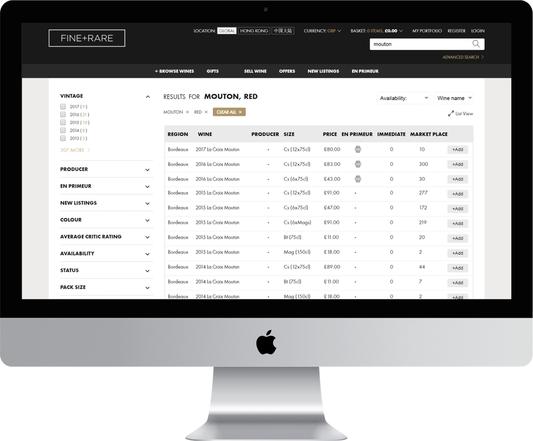
Vintage, producer, size, price, availability — these are columns. A grid hides them in cards and forces scrolling; a table puts them side by side and lets the buyer scan down a list.
Interventions
- Replaced the grid with a scannable tabular list, showing more detail in less space — with a toggle so buyers who prefer the grid can switch back
- Moved the filters to the left-hand side, where Jakob’s Law says people expect to find them
- Re-sequenced the filters by how often they were actually used
- Truncated each filter to its top five options with a ‘see more’, so more filter categories fit above the fold
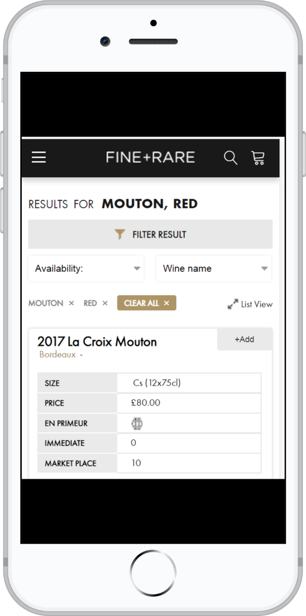
- On mobile, a filter button at the top of the page and a table that adapts rather than breaks
Evidence