Takeaway
Google Ads tuned to the last penny can still underperform when the landing page leaks. The cheaper win is optimising the post-click experience.
Brief
Increase customer acquisition and reduce the cost per acquisition from Google Ads.
Starting point
Inspired were spending month on month on paid search and had already squeezed what they could out of cost-per-click and click-through rate across the keyword portfolio. The account was optimised. The landing page was not.
Insight
People who signed up spent two minutes on the page. People who didn’t spent under one.
The reading: before handing over their details, visitors were looking for reassurance about the service and could not find it quickly enough.
Most visitors never scrolled, so they never saw the value proposition.
The reading: these visitors were already in-market. They did not want a feature list — they wanted to judge the brand’s credibility fast and get on with it.
Interventions
- A two-speed landing page, with second-tier content carrying the brand and credentials for those who needed reassuring
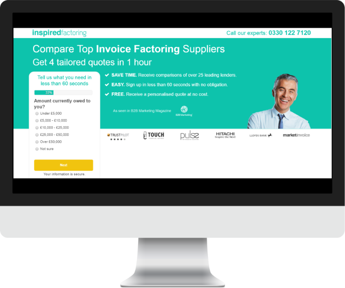
- 80% of the effort spent above the fold — less clutter, more attention on the call to action — and 20% on brand authority further down
- Contextual matching: headings rewritten to echo the paid search ad copy that brought people there
- Navigation removed — the few who used it converted at a lower rate
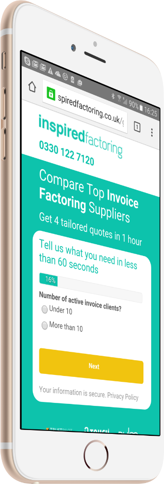
- Progress indication on the form, and radio buttons in place of dropdowns — more steps, but easier ones
- The whole page narrative reframed around benefits rather than features
Evidence