Takeaway
For form-heavy pages, visitors judge on perceived effort, not actual effort. It’s all about perception.
Brief
Increase website conversion rates and reduce the cost per acquisition from Facebook Ads.
Starting point
Almost all the traffic came from Facebook Ads, and it landed on a signup page built around one long vertical form. Every extra click of ad spend was being poured into a page that asked for a lot before it explained why.
Insight
Perceived effort, not actual effort, was losing the signup.
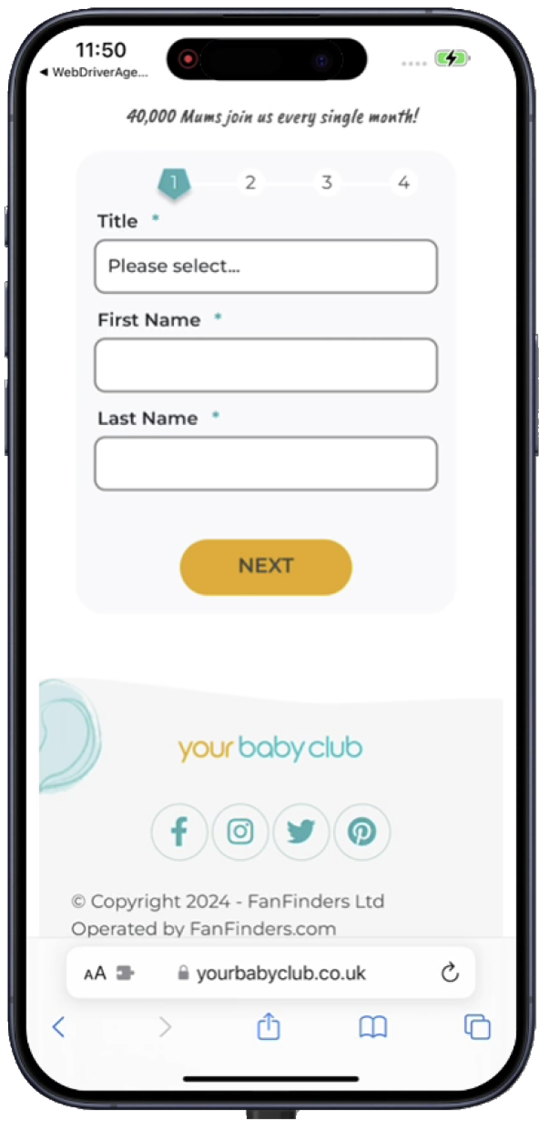
The research produced three hypotheses, and the test ran all three together: breaking the signup into steps would reduce the perceived level of effort; expressing the why rather than the what would give mums a compelling reason to sign up; and showing top-tier brand logos would communicate the value proposition visually and endorse credibility.
Interventions
- Rebuilt the signup as a numbered, step-by-step flow with visible progress
- Rewrote the page around the reason to join — “claim your offers” — rather than a description of the service
- Added recognisable brand logos as visual proof of what members actually get
- Designed, built and ran it as a controlled A/B test, in desktop and mobile
Evidence